Matplotlib exercise
NOTE: Use Enthought slides.pdf Matplotlib tutorial to help with this exercise.
Gen AI examples:
- Show me code to make a multipanel plot in R?
- How can I plot an image in Python?
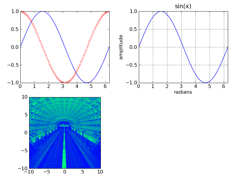
In Jupyter, create a plot display that looks like the following:

Photo credit: David Fettig _
In [ ]:
# Copyright 2015 Enthought, Inc. All Rights Reserved
"""
Plotting
--------
This is a 2x2 layout, with 3 slots occupied.

1. Sine function, with blue solid line; cosine with red '+' markers; the
   extents fit the plot exactly. Hint: see the axis() function for setting the
   extents.
2. Sine function, with gridlines, axis labels, and title; the extents fit the
   plot exactly.
3. Image with color map; the extents run from -10 to 10, rather than the
   default.

Save the resulting plot image to a file. (Use a different file name, so you
don't overwrite the sample.)

The color map in the example is 'winter'; use 'cm.' to list the available
ones, and experiment to find one you like.

Tip: If you find that the label of one plot overlaps another plot, try adding
a call to `tight_layout()` to your script.
"""
In [12]:
# Import the modules or libraries you will need.
# For Python these are numpy, matplotlib.pyplot
# For R these are magick, ggplot, and others.

# Create a 1D array 'x' with ~100 divisions between 0 and 2*pi, hint: linspace()
# Use x to create two more arrays with values sin(x) and cos(x)
# Plot those in the first subplot.  When you are done, the plot should look like panel 1 in the image above.


# 2nd subplot: Follow the instructions above to replication panel 2 in the image above.


# 3rd subplot. Read the image dc_metro.JPG into python and plot as a colormap.


# Don't forget to issue the 'show' command
# plt.show()


#plt.savefig('multipanel_.png')
What to submit:
Upload the following files to Brightspace Assignment Week03
- A completed copy of this .ipynb that can reproduce the figure sample_plots.png
- A .png or .jpg copy of the figure you generated with this code.
In [ ]: